.png)
Comparison Table Sections: Setup and Tips
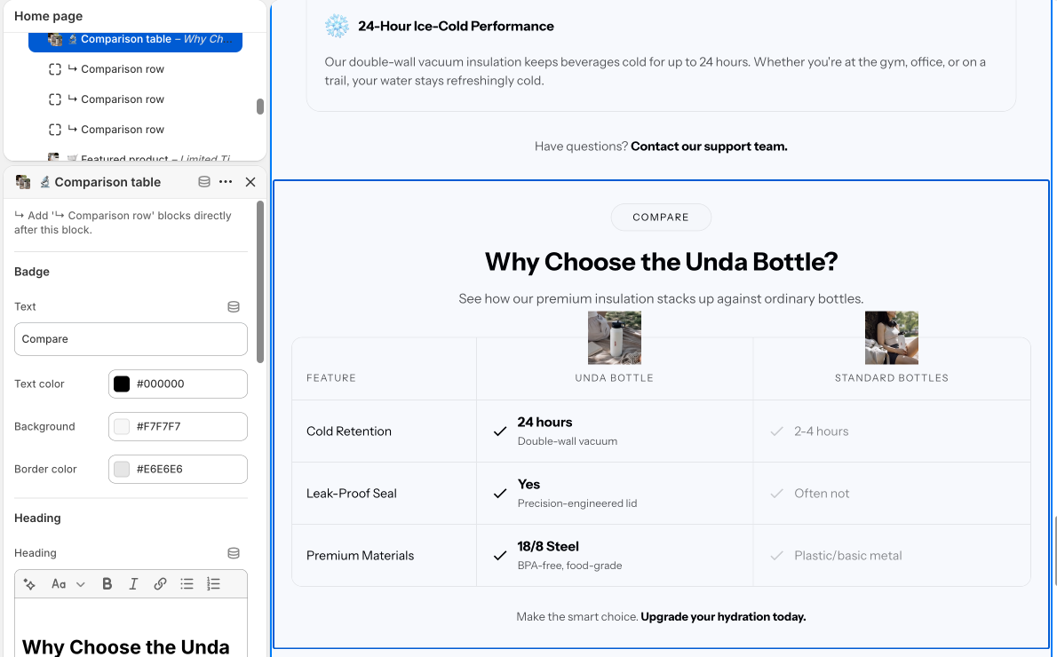
Comparison tables show shoppers why your product wins. Us versus them, product versus product, or plan versus plan. Our most popular ones are Comparison Table #6 and Comparison Table #29.
Add one
In the theme editor, click Add section and search for comparison. Pick the style you purchased. Tables work on any page: home, product pages or a dedicated landing page.
Build your rows and columns
Each column is a block. Your product goes in the highlighted column, competitors in the plain ones. Each feature row has a text label plus a check or cross per column. Keep rows short, five to eight features is the sweet spot. Shoppers skim.
Tips that convert
- Name real competitors only if you are comfortable doing so. Generic labels like Other brands work fine too
- Lead with the features where you clearly win
- Use your accent color on your column so the eye lands there first
On mobile
Tables get tight on small screens. Preview the mobile view in the editor and trim columns or shorten labels if things wrap. Two to three columns is comfortable on a phone.
Want a comparison style we do not sell yet? Tell us at daniel@section.store or help@section.store.